Navbar Setup
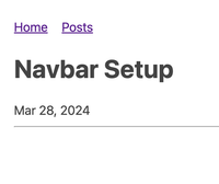
Mar 28, 2024As of writing, there is a navbar at the top of the site. For example, when writing this post, this is what it looks like in my preview environment:
This was done with the official navigation plugin, and was quite simple to set up after some tinkering.
I'm not using most of what the plugin offers, and I could probably have accomplished it more easily with just some hard links, but that would be less fun.
Adding items to the navbar
First, I had to put some information in the frontmatter for pages that I want to appear in the navbar. On my pages index page, that looks like this:
eleventyNavigation:
  key: Posts
That "key" is basically the name of the page, as it will appear in the navigation. You could add a "parent," but I didn't bother with that.
As of writing, I only have two items there - Home and Posts. So that's just two tags, one on the Home page and one on the Posts index page, and they are automatically added to the navbar.
Rendering the navbar
I rendered the navbar as suggested in the official docs. In my primary layout file (currently that's _includes/main.njk), I have this:
important note: These { should be double braces, but when I put those in this document, 11ty got confused and tried to render them in this post document. Lol. So just keep that in mind.
    <body>
      <div class="container">
        <div class="nav">{ collections.all | eleventyNavigation | eleventyNavigationToHtml | safe }</div>
        <div class="main">
          <h1>
            { title }
          </h1>
          { page.date | postDate }
          <hr>
            { content | safe }</div>
        </div>
      </body>
The important part here is the stuff inside of the nav div, which I just copied from the docs.
I also wrapped the rest of the page in a few divs. A top-level container, and inside of it nav and main. This let me write CSS targeting those divs.
body {
    font: 18px/1.5 -apple-system, BlinkMacSystemFont, "Segoe UI", Roboto, "Helvetica Neue", Arial, "Noto Sans", sans-serif, "Apple Color Emoji", "Segoe UI Emoji", "Segoe UI Symbol", "Noto Color Emoji";
    color: #444;
    margin: 0;
    padding: 0;
    max-width: 100%;
}

.container {
    display: flex;
    flex-direction: column;
    max-width: 800px;
    margin: 40px auto;
    padding: 0 10px;

}

.nav ul {
    list-style: none;
    padding: 0;
    margin: 0;
    display: flex;
}

.nav ul li {
    margin-right: 20px;
}

.nav ul li:last-child {
    margin-right: 0;
}

.main {
    flex: 1;
    padding: 0px;
}

h1, h2, h3 {
    line-height: 1.2;
}

@media (prefers-color-scheme: dark) {
    body {
        color:#c9d1d9;
        background: #0d1117
    }
};
This is based on a simple css reset that I found somewhere that I, unfortunately, can't find again. I then used chatgpt to ask some questions, since I'm not a CSS expert. But anyways, that gets the navbar to appear above the main content, and everything is nice and centered.